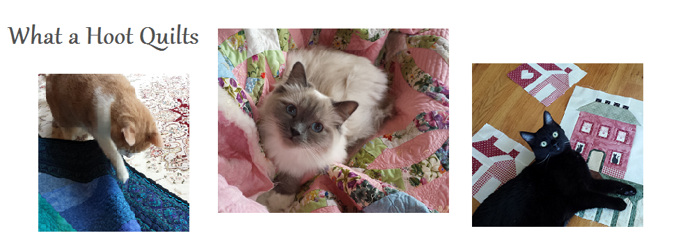


Miss Kitty Winter Receiver
fabric: "Miss Kitty's Colors" by Marie Cole for Henry Glass
paired with Minkee Cuddle Smooth in Platinum
31" square
I just love this pink print so much!! It is adorably sweet, and it pairs perfectly with a pearl gray solid. - Minkee, to be exact in this case!

I used a tutorial posted by the Utah State University Cooperative Extension: "Mitered Corner Blanket".
My pieces were cut different sizes, though, to fit the dimensions of my Miss Kitty piece. The pink print was 27" square, and the Minkee was 36" square. That yielded a nice-sized 31" blanket with a pretty proportion for the self-border.
 |
| Seriously! How Cute Can You Get - hugging the mouse, reading to it. . . |
I don't have an infant to swaddle, so our own household Miss Kitty gets to show off the absolute cuteness of this blanket.

Working with the Minkee in this case was a little more difficult than a normal cotton or flannel would have been, but not overly daunting. I will say, though, that it is WARM! You would not want this backing on it in Arizona during the summer, say. But for a Colorado winter baby, it is perfect. :)

Take a look at the other projects I worked up from the "Miss Kitty's Colors" collection. If you might be interested in taking on the Henry Glass challenge, their information is included here. Don't let it intimidate you - I am just a normal private quilter, and I also had a much longer deadline than the usual 3 weeks, so I went a little crazy with my work. :)
#1 - "Love from Above for Emma" - original design
#2 - Jaycee's messenger bag
#3 - "Kitty Titty Power" with ruler tip
#4 - Miss Kitty Winter Receiver (you are here)
#5 - Travel packing bags
#6 - "Kitty Shuffle" - original with tutorial
#7 - "Soft Kitty, Warm Kitty" - original with tutorial
#8 - Selvages - with tutorial
#2 - Jaycee's messenger bag
#3 - "Kitty Titty Power" with ruler tip
#4 - Miss Kitty Winter Receiver (you are here)
#5 - Travel packing bags
#6 - "Kitty Shuffle" - original with tutorial
#7 - "Soft Kitty, Warm Kitty" - original with tutorial
#8 - Selvages - with tutorial